2026
LUN
Brand identity
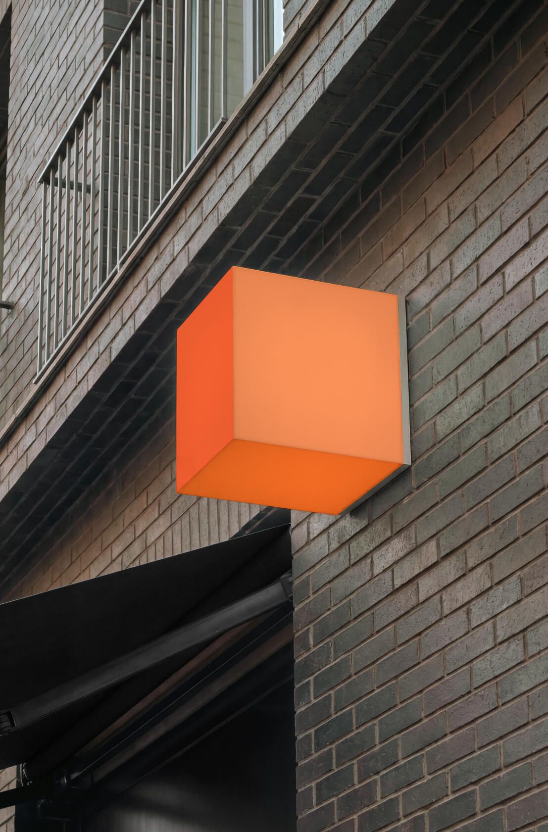
We always treat brands with respect and, when it comes to brand identity, tend towards evolution rather than revolution. But this time, the challenge was a cube of complexity. So how do you build a brand identity when your main brand attribute is an orange cube?
The rule ‘if you can’t change something, learn to love it’ came in handy.
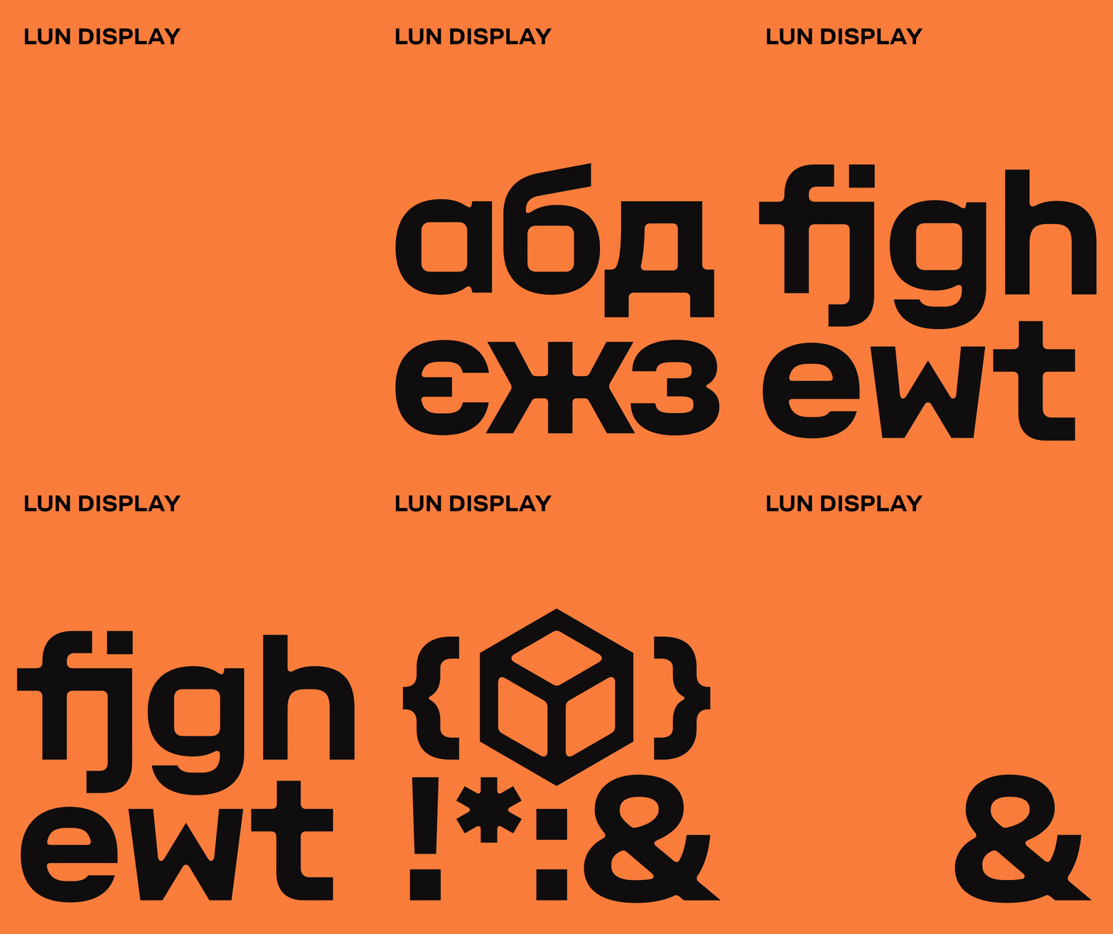
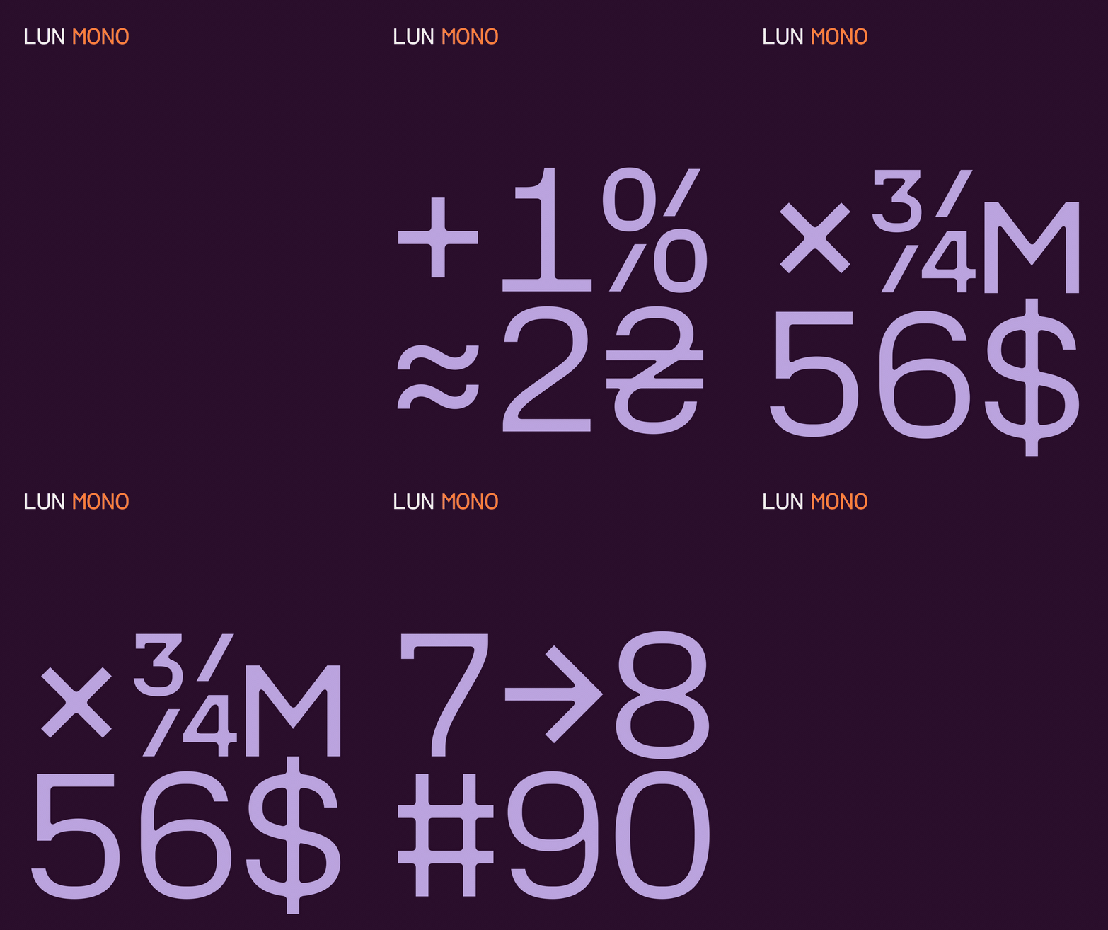
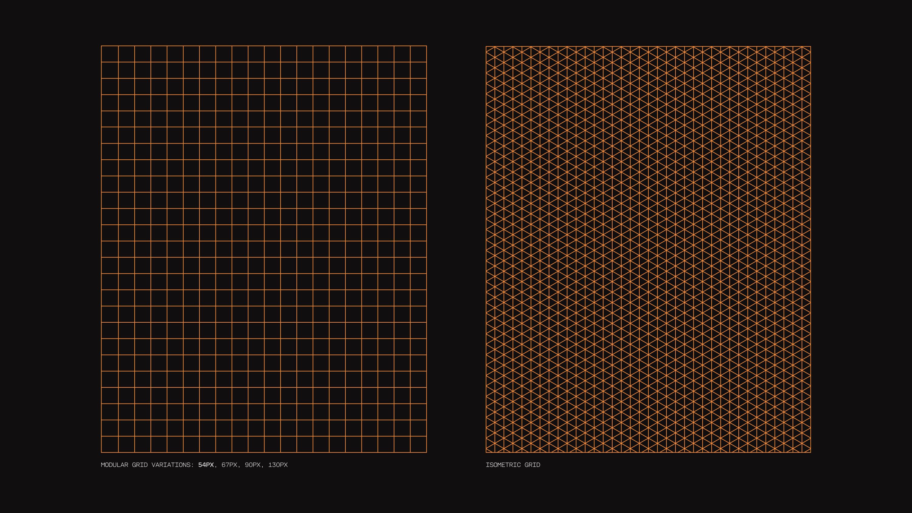
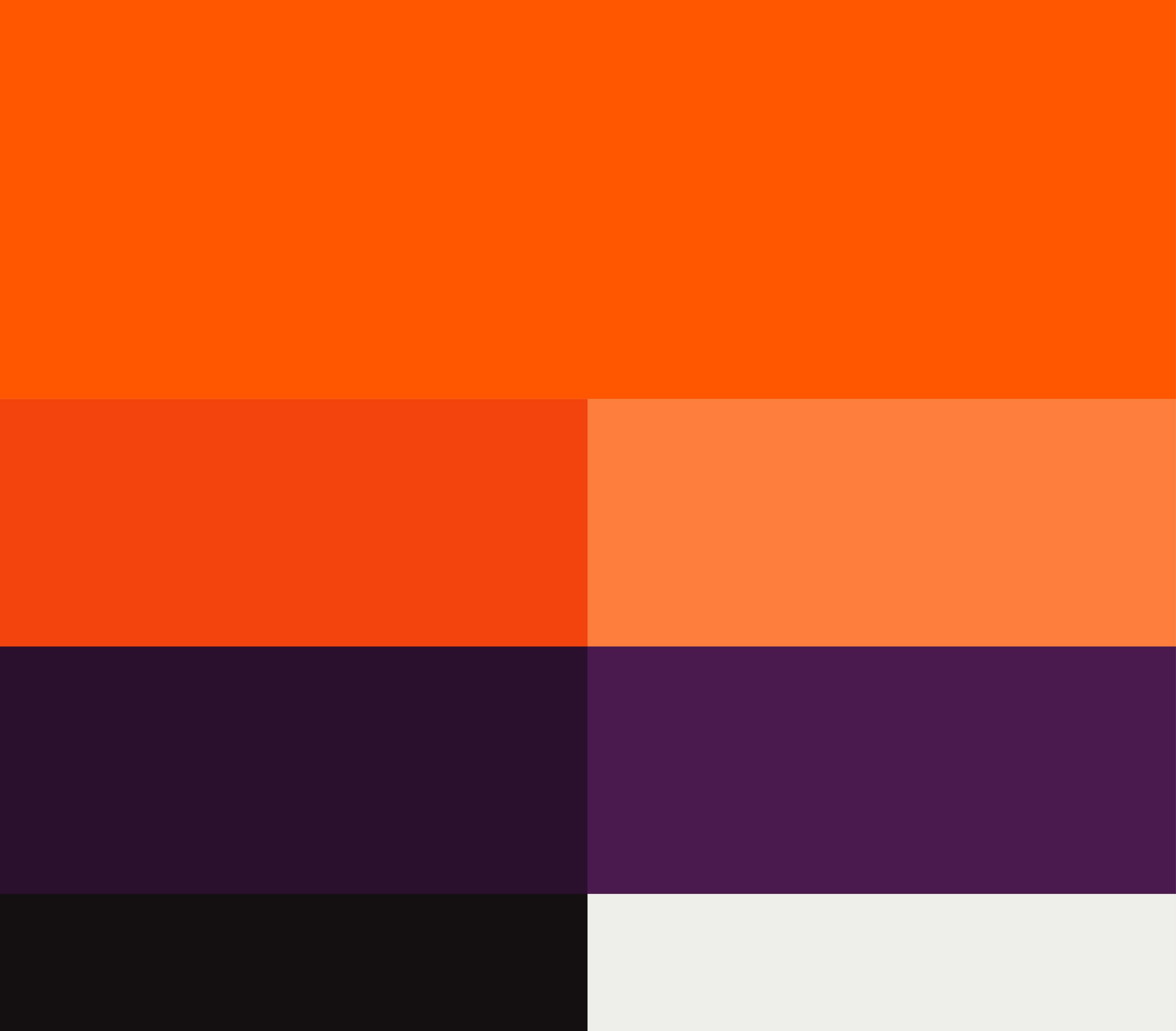
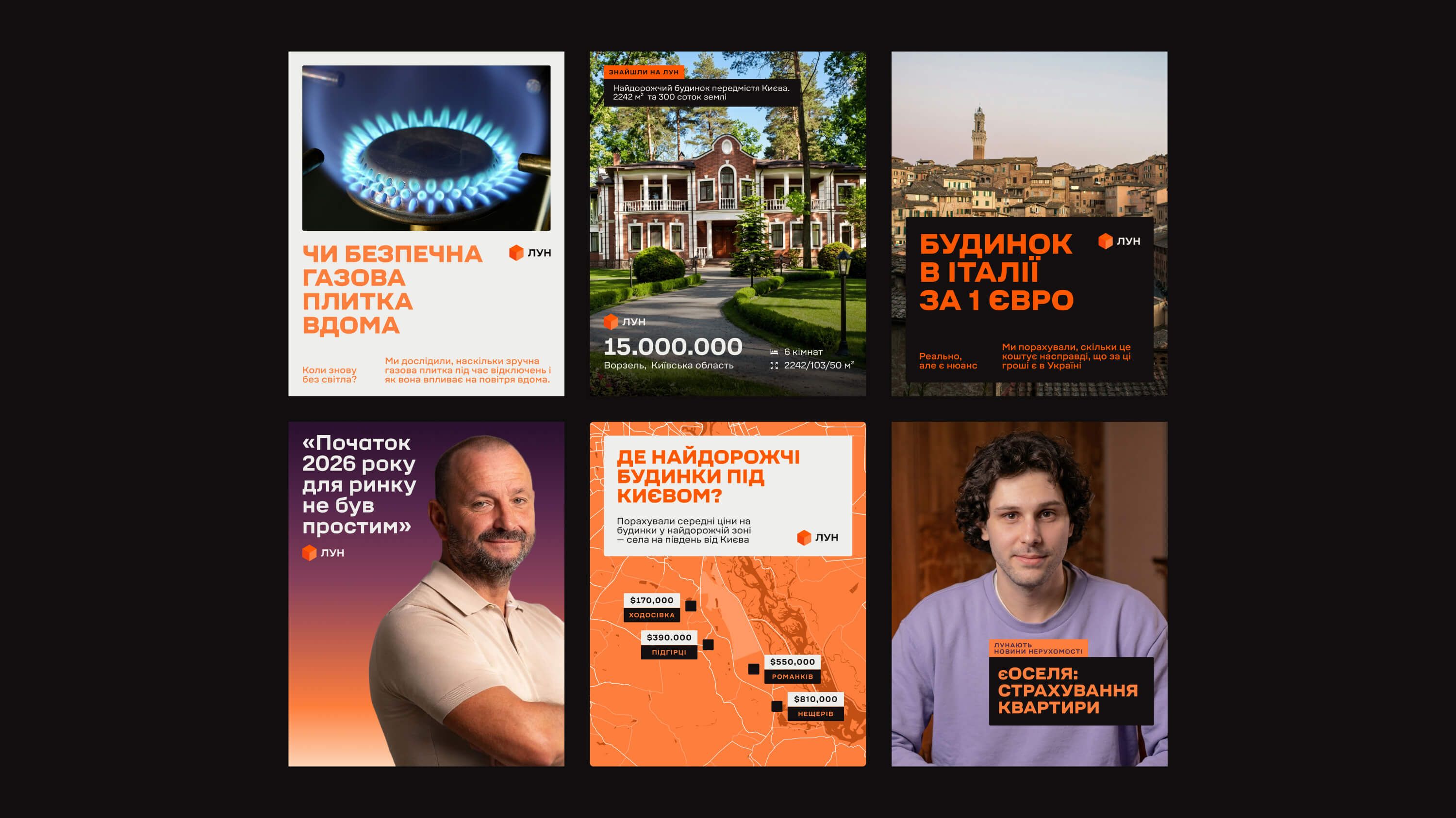
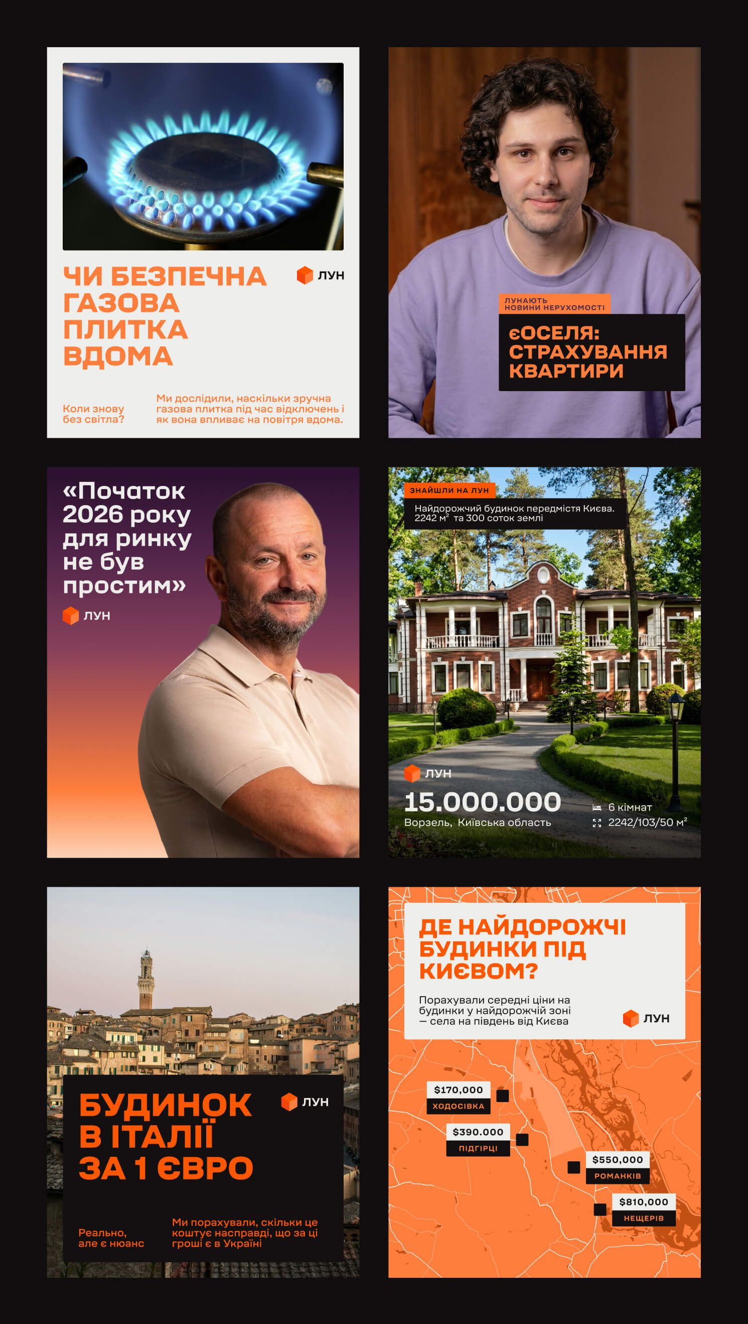
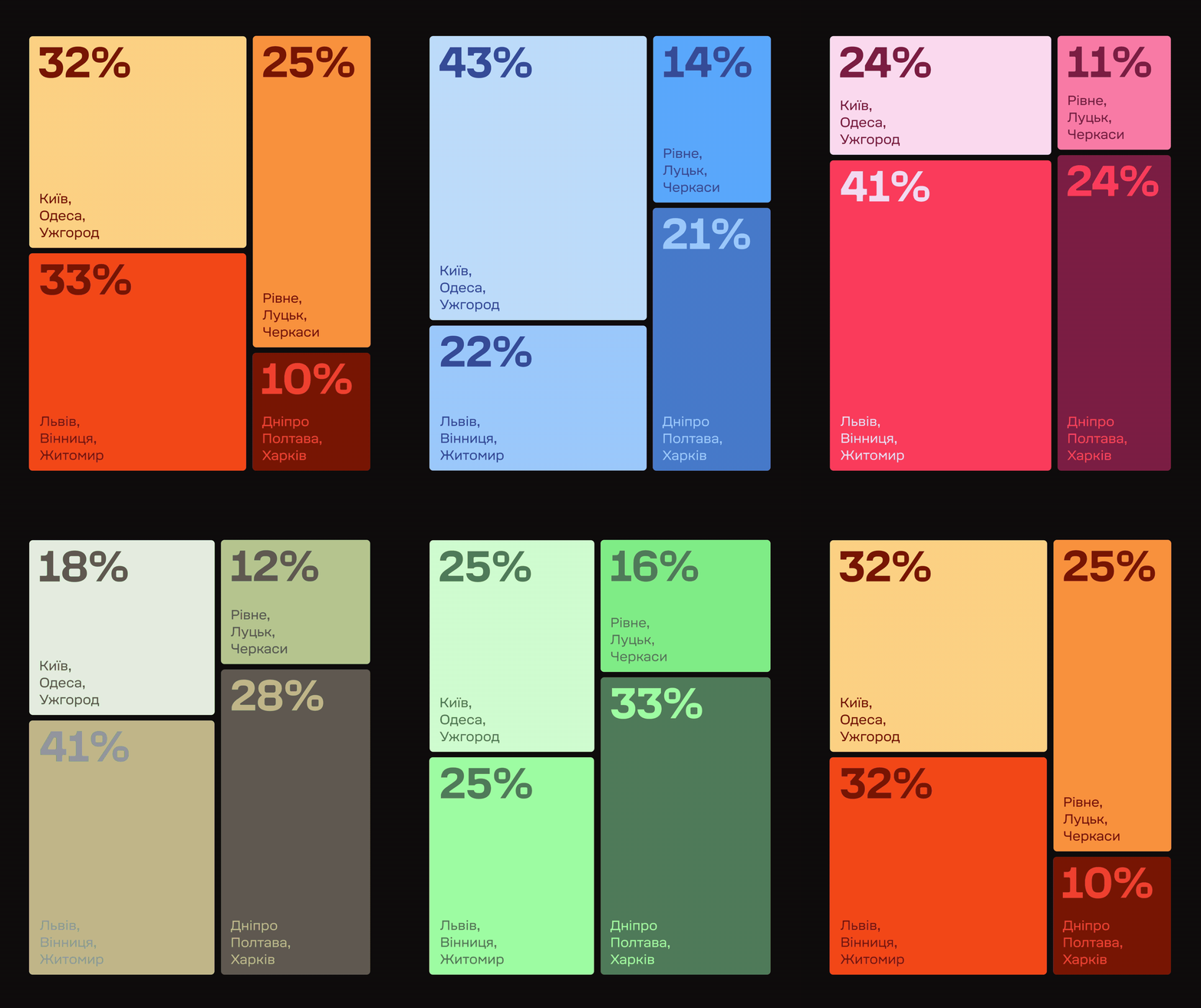
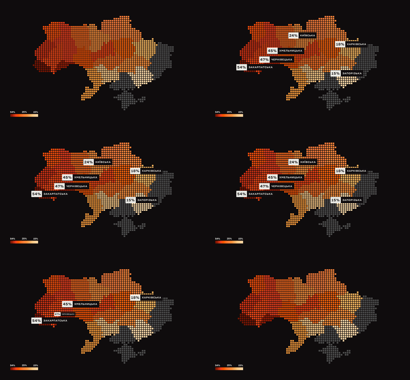
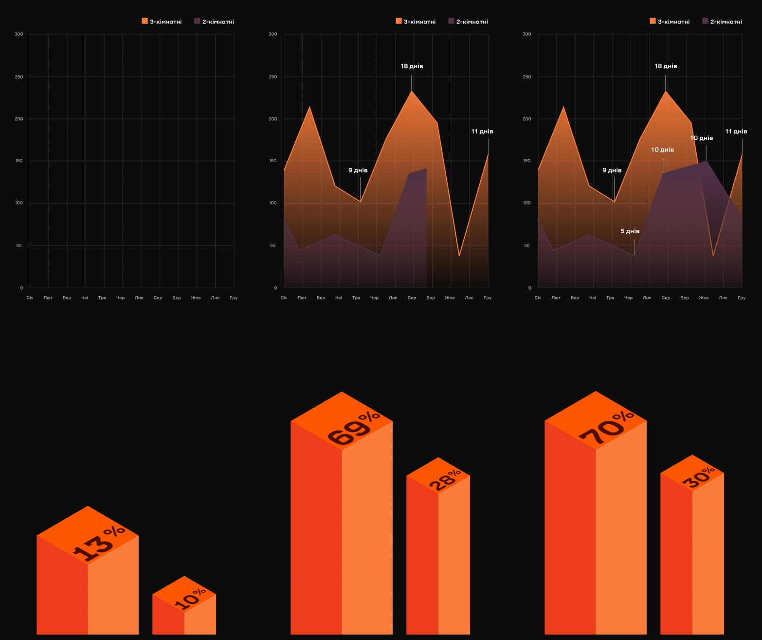
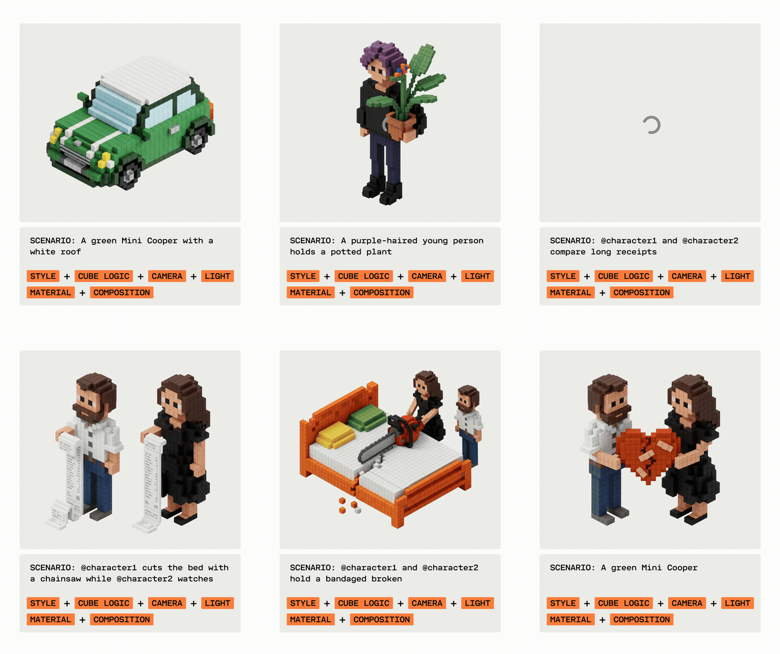
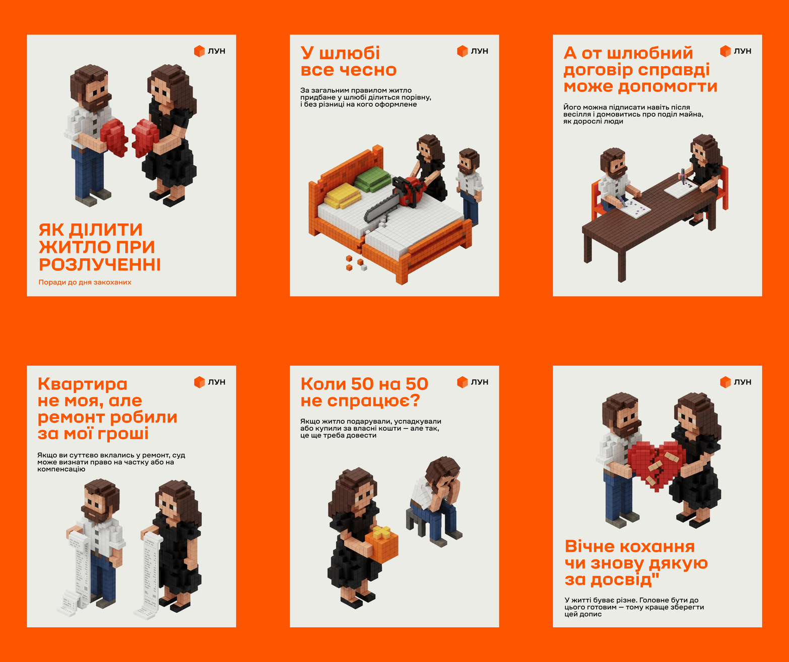
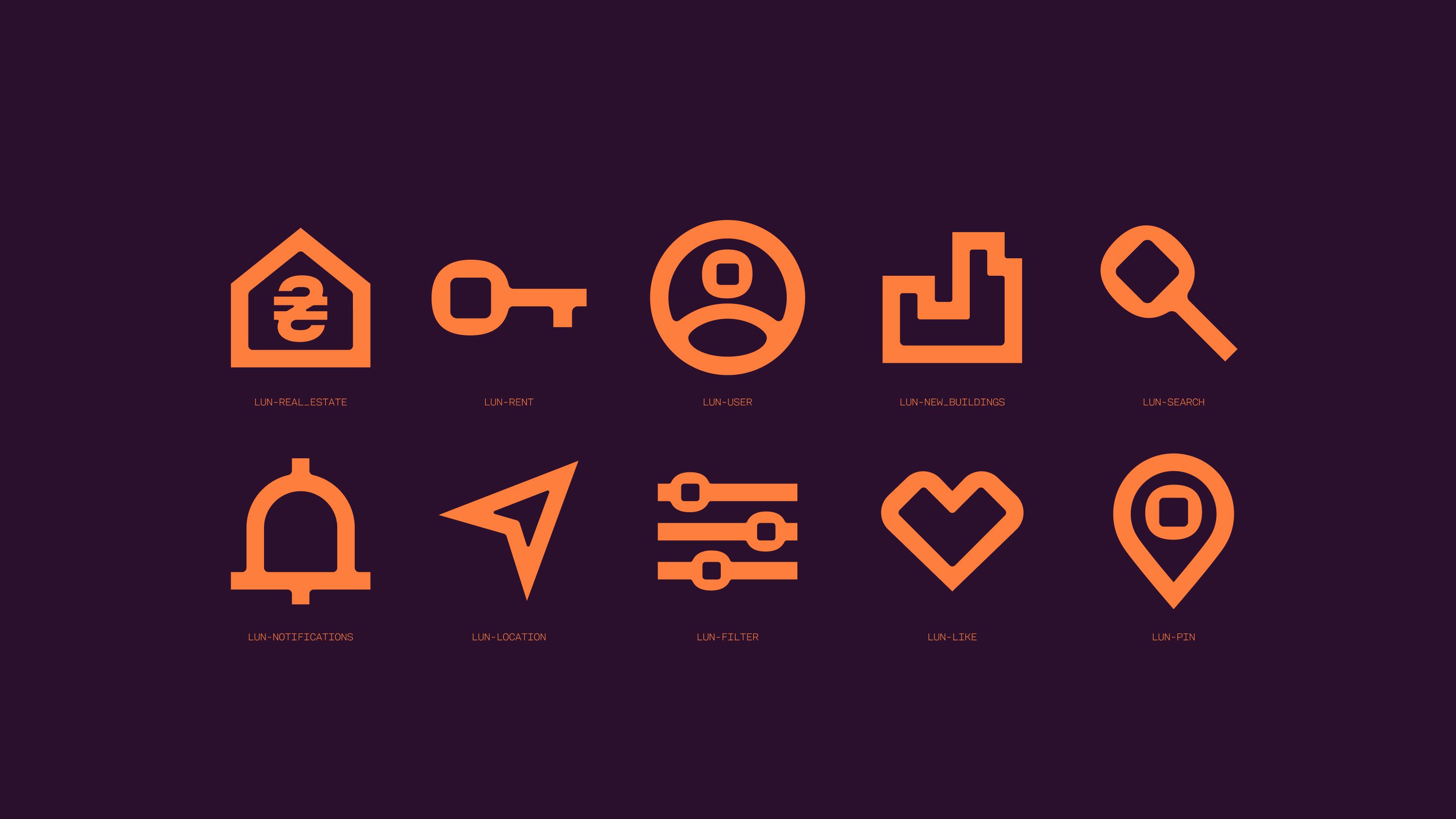
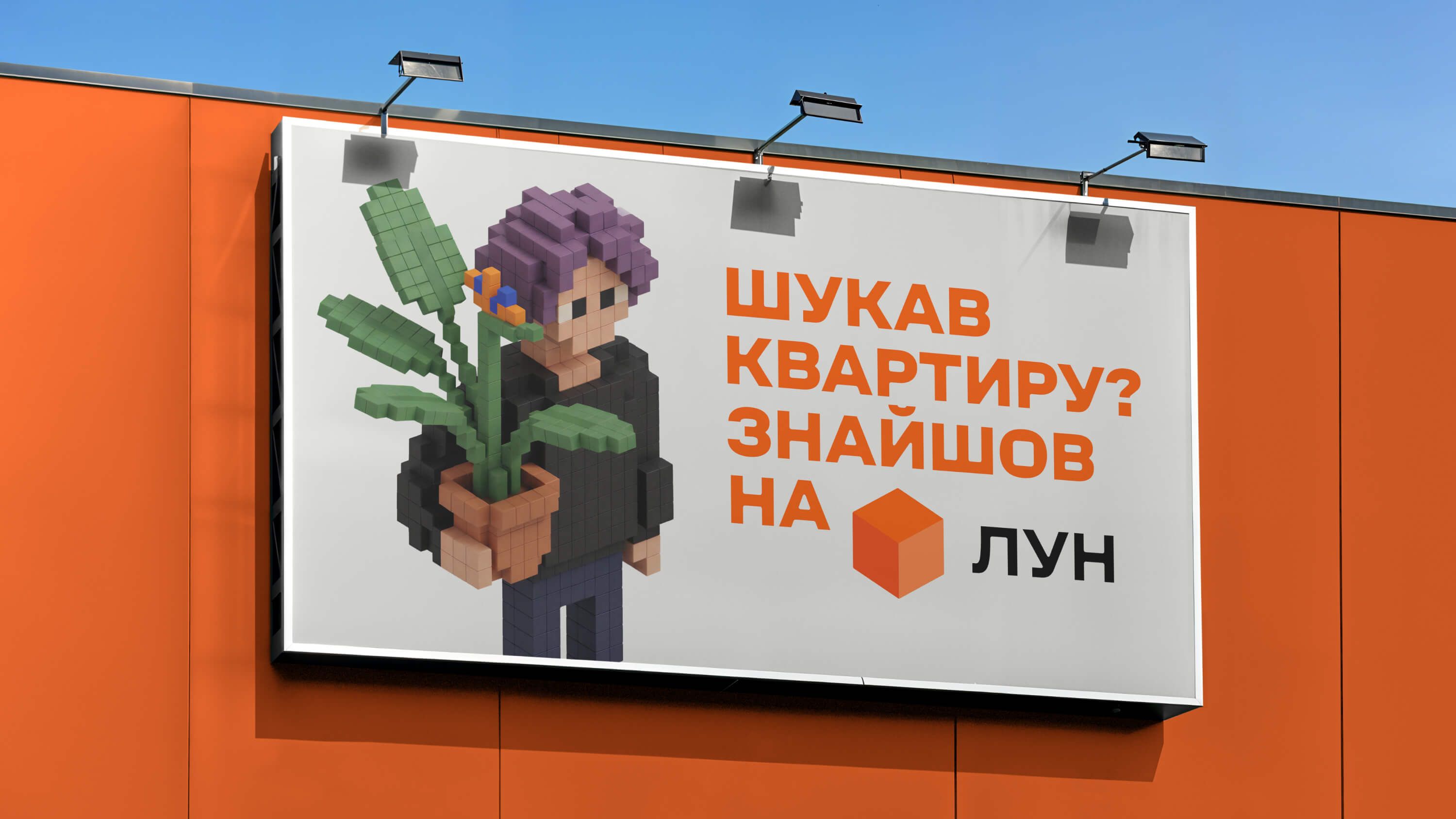
As a result, the cube and its 2D counterpart, the square, inspired our typeface, grid system, and the style of our infographics and illustrations. All of this combined allowed us to create a flexible and modern design system. So long live the orange cube! And congratulations to our friends at LUN on the rebrand.