2026
Avellum
Brand identity
We like to believe that good brand identity isn’t about conjuring something new out of thin air, but about drawing out what already exists within the brand. That’s why, whether we’re creating new styles or refreshing existing ones, we tend to approach the task like designer-archaeologists — ready to dig as deep as it takes.
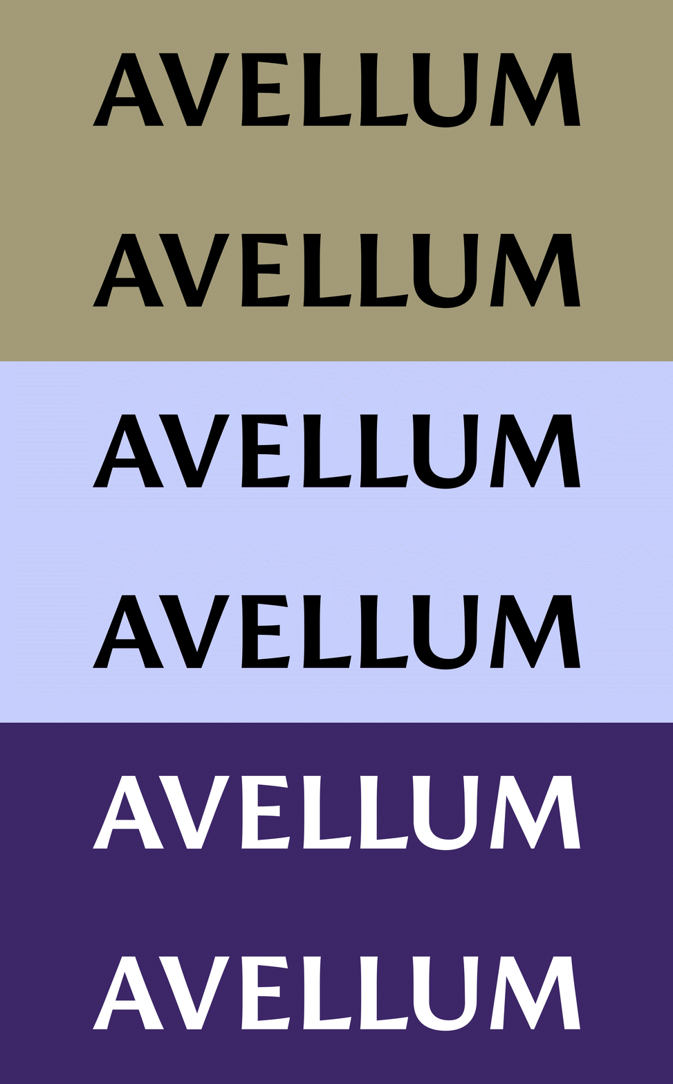
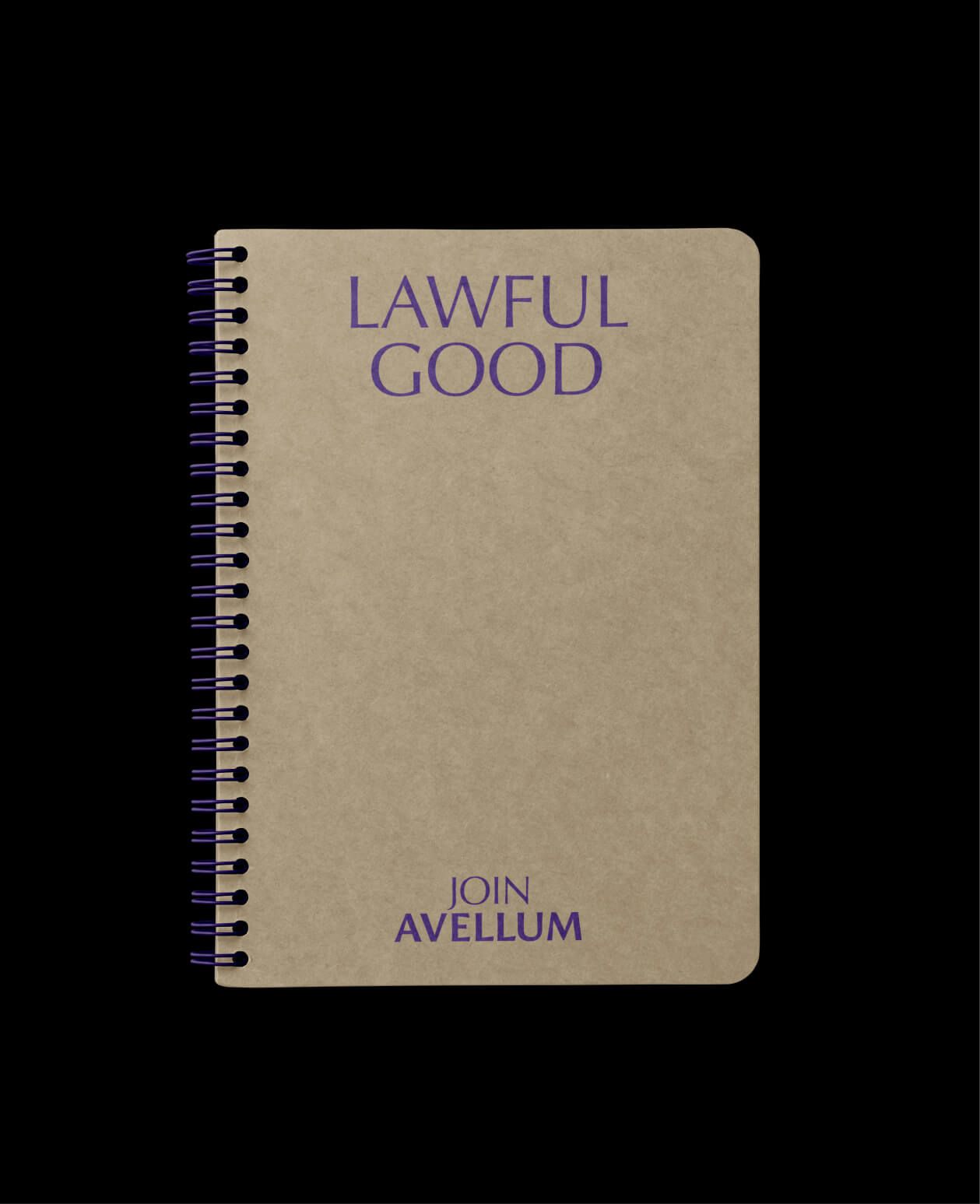
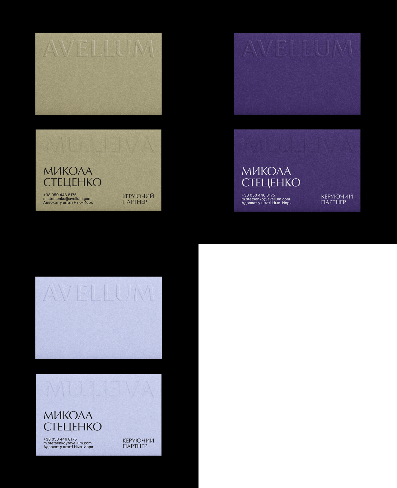
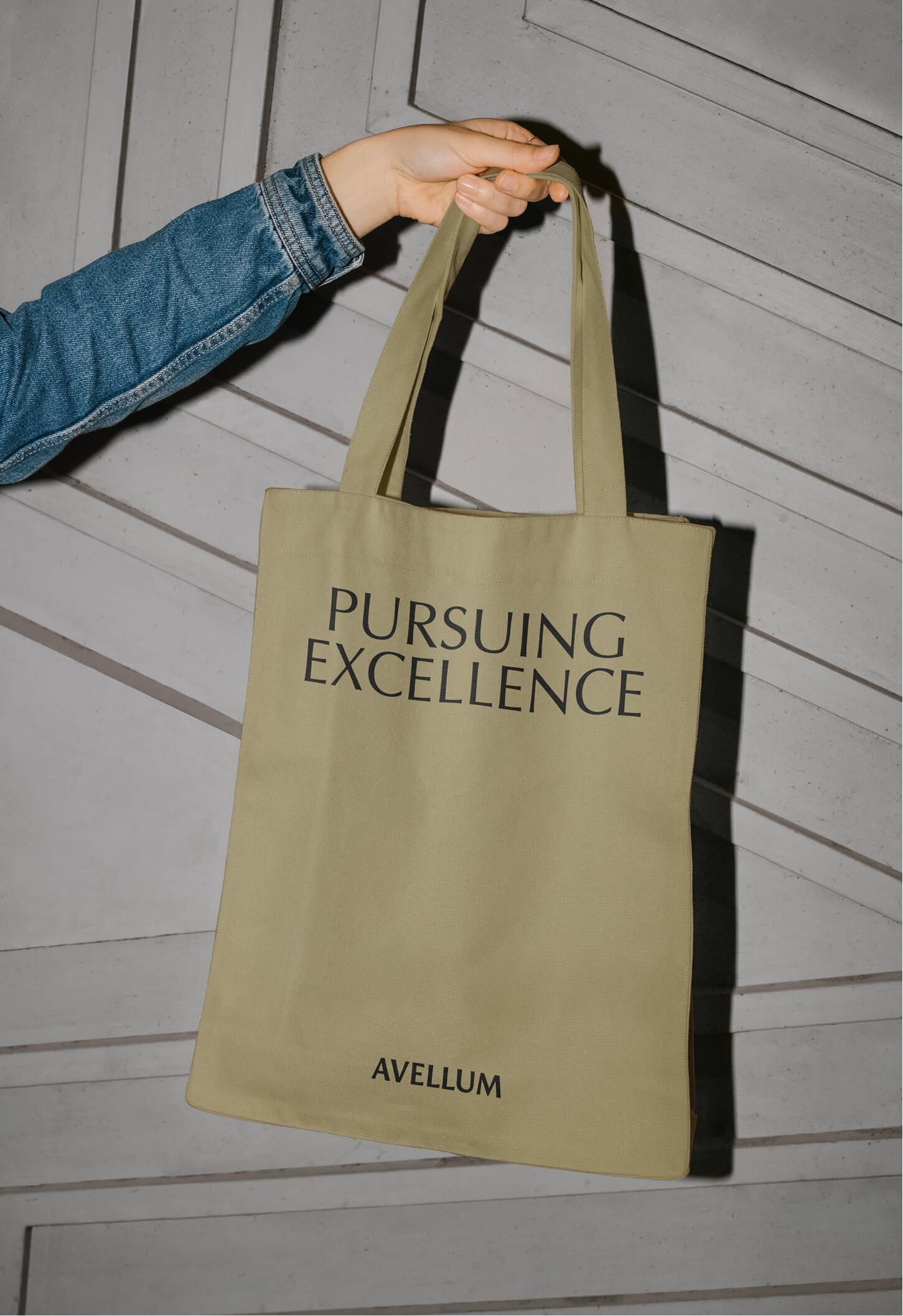
For the new brand identity of the law firm Avellum, for instance, we drew on a colour embedded in the company’s name itself. The name Avellum comes from the Latin vellum — parchment, as a metaphor for something eternal, stable and enduring. The parchment-like golden hue contrasts with the cool purple tones that were previously part of the brand identity, and it now sits far more comfortably in both print and digital.
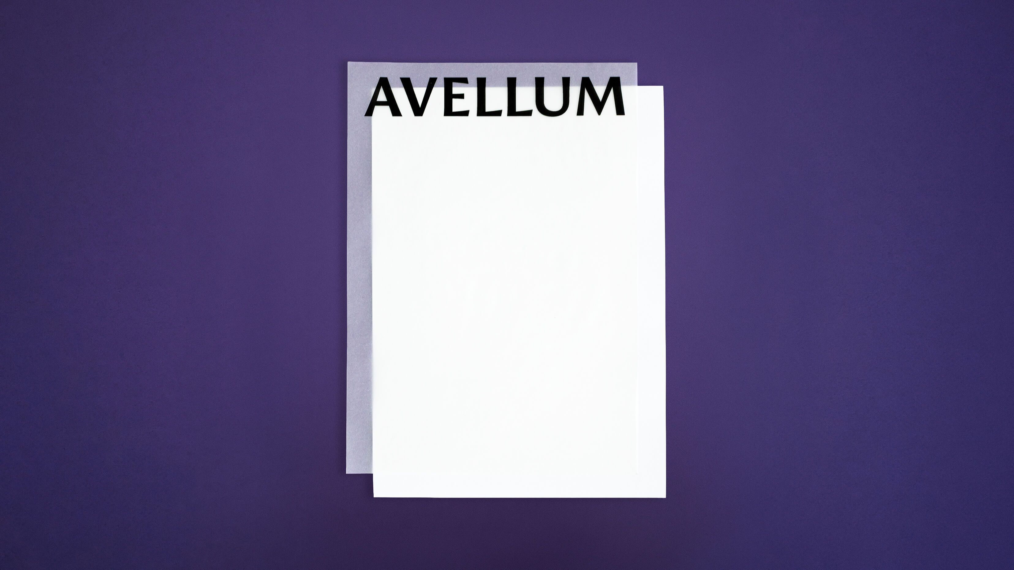
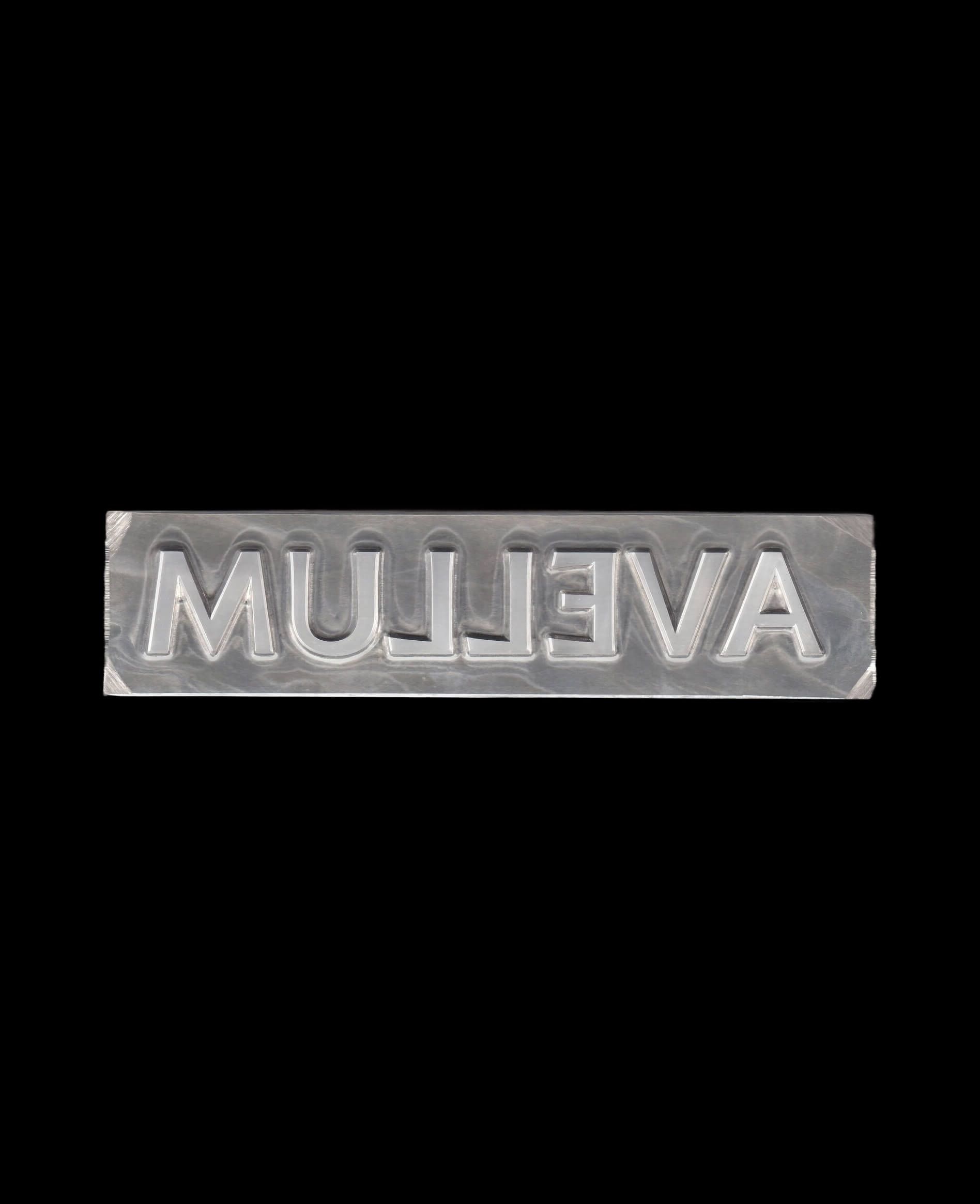
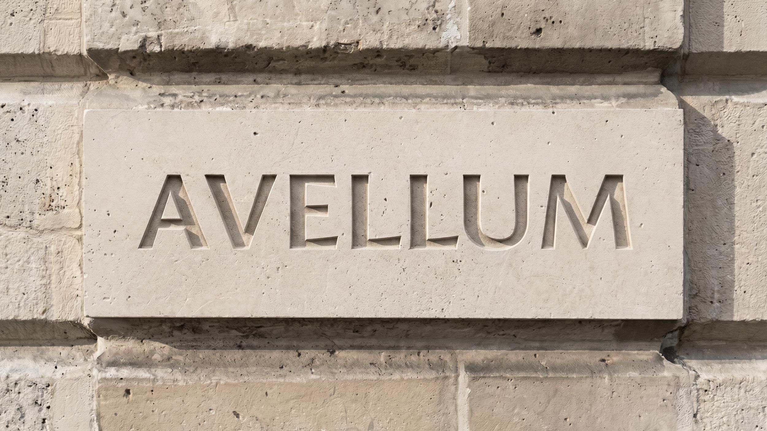
The typographic logo helped convey the company’s character: a respect for classical approaches paired with no fear of innovation. It’s based on a classic serif typeface, yet does without strict serifs.
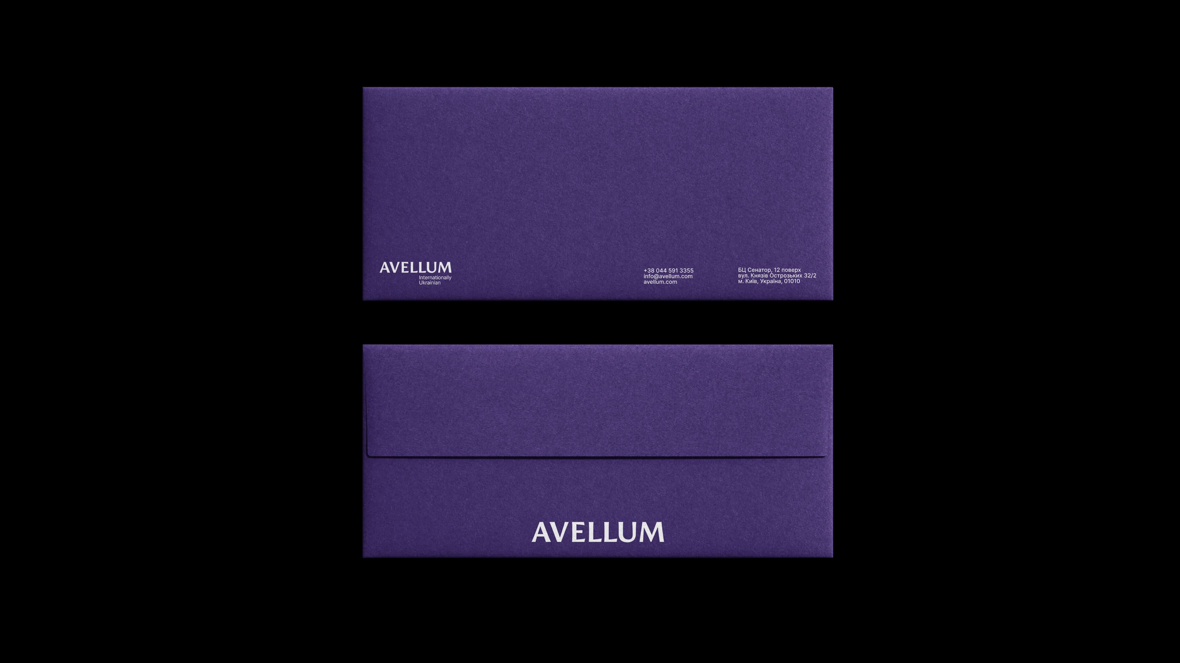
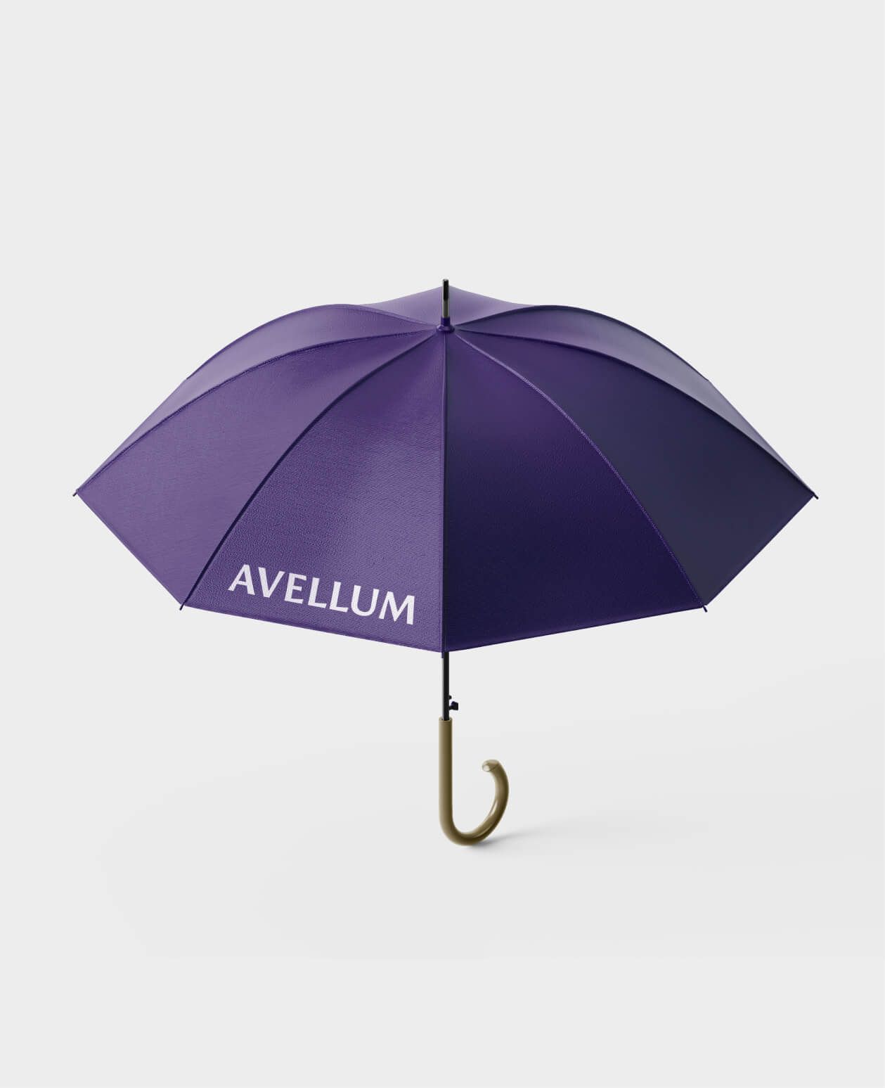
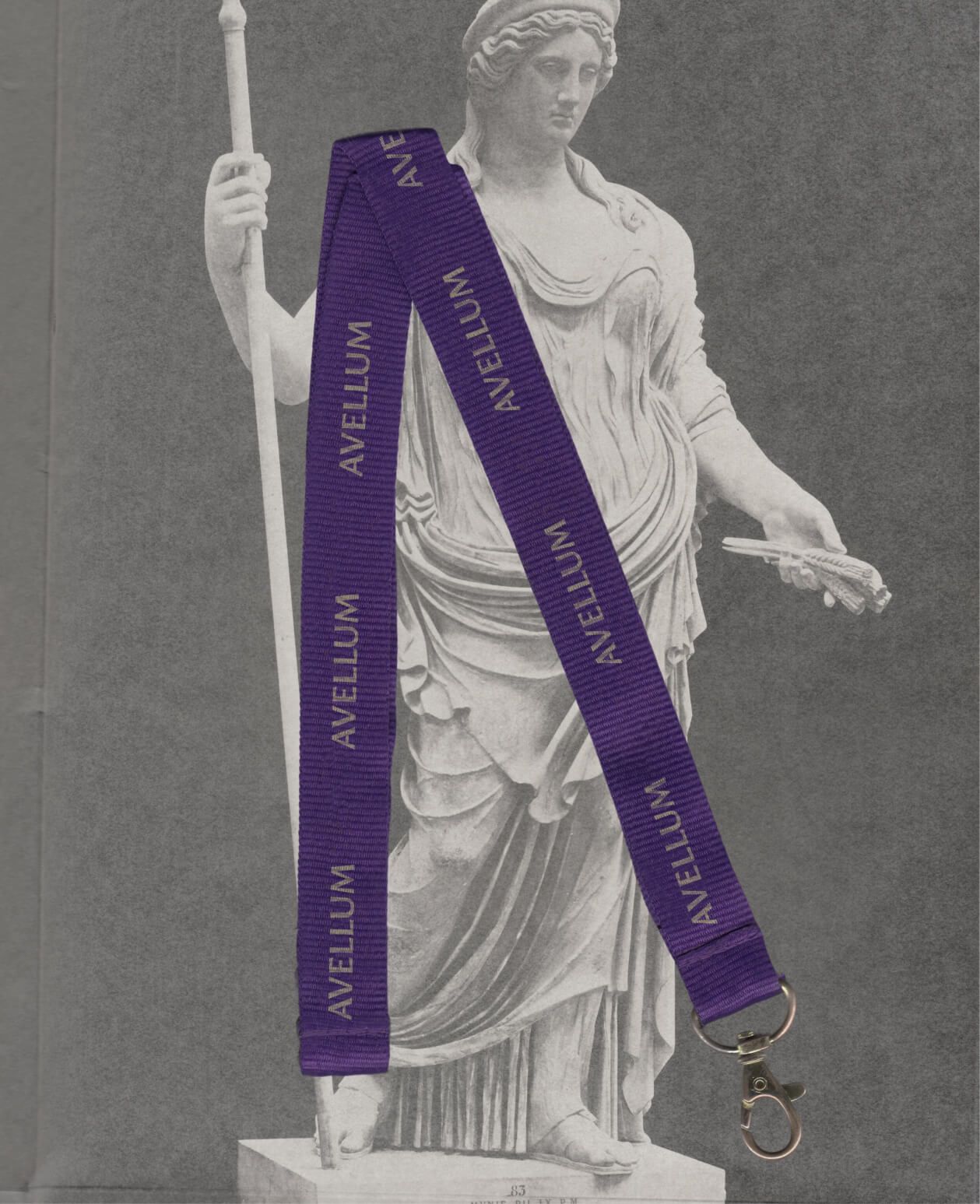
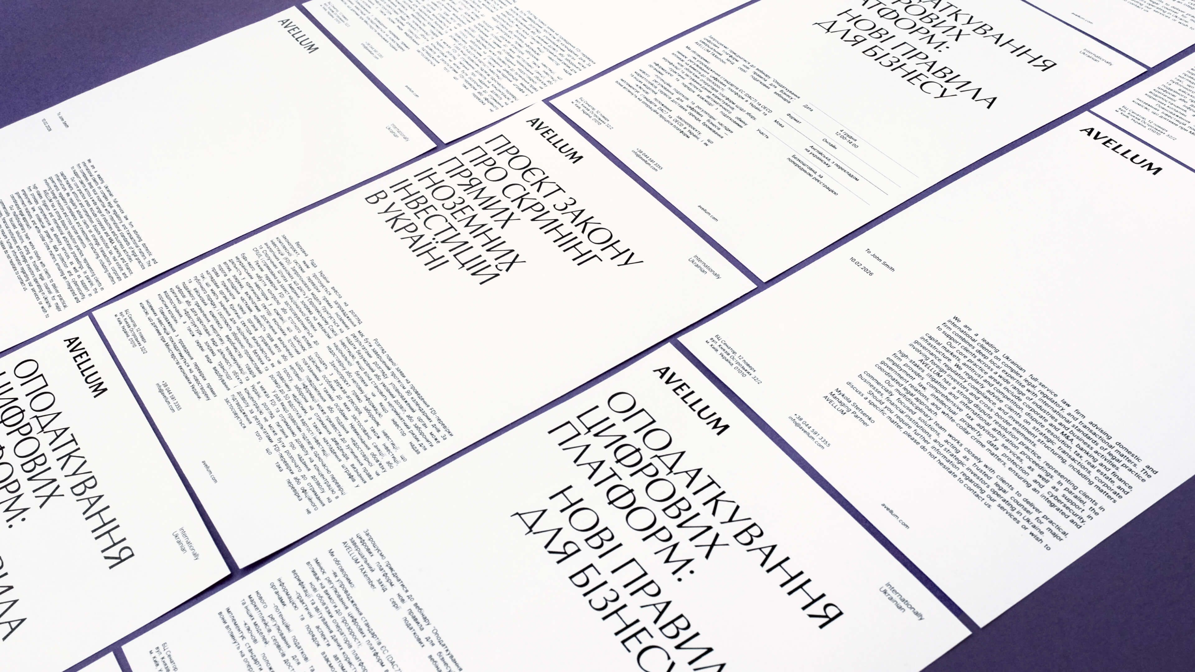
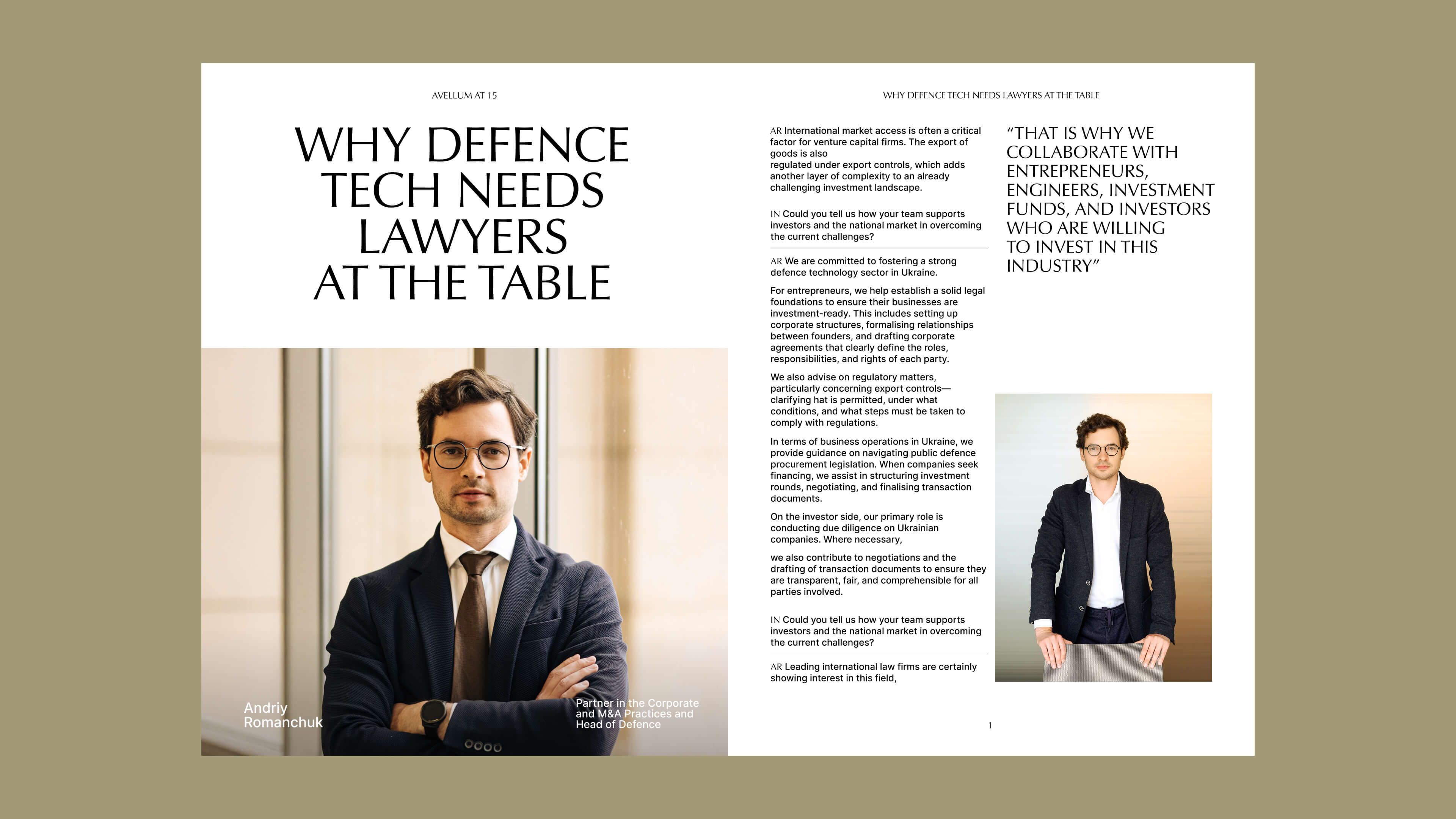
We created a scalable design system and tested it across a range of formats — from printed materials and stationery to presentations, email newsletters, social media and interior signage. We also developed a style guide to help the brand handle different content while maintaining stylistic consistency.
Thanks to this visual refresh, Avellum has brought its distinctiveness to the fore, become more expressive and gained the design tools to develop its style across a variety of platforms.
Excelsior, as they say.